Cooper’s Daughter is still building the awareness and familiarity needed to be considered by female consumers.
For this audience, choosing a spirit is about more than taste — it reflects quality, intention, and the story behind what they choose to share.
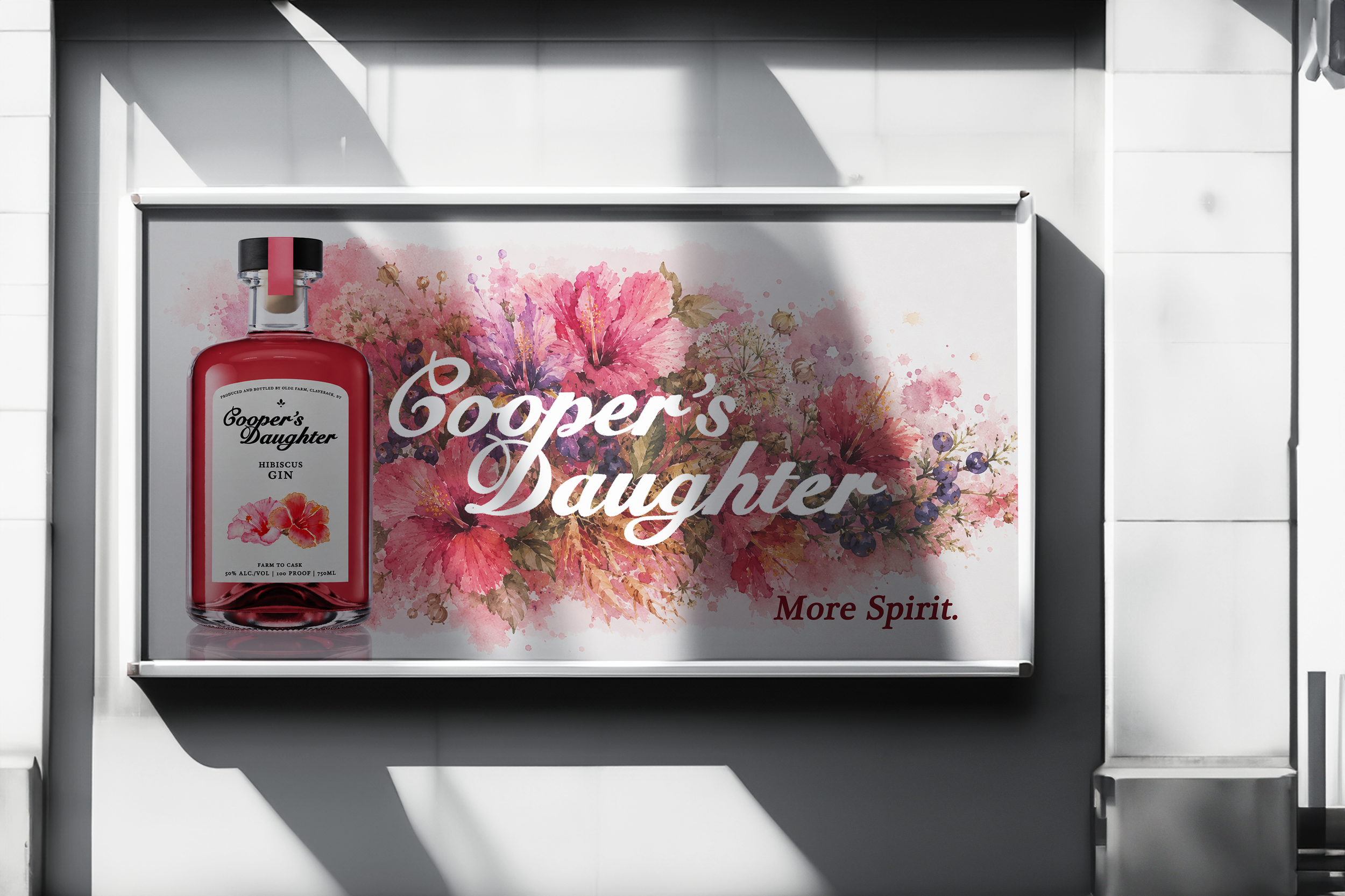
The opportunity is to position Cooper’s Daughter as more than what is seen on the outside of the bottle, highlighting it as a premium, woman-owned brand rooted in craftsmanship and Hudson Valley heritage. By leaning into its story and deeper meaning, the brand becomes something worth choosing, sharing, and remembering. Cooper’s Daughter. More Spirit.
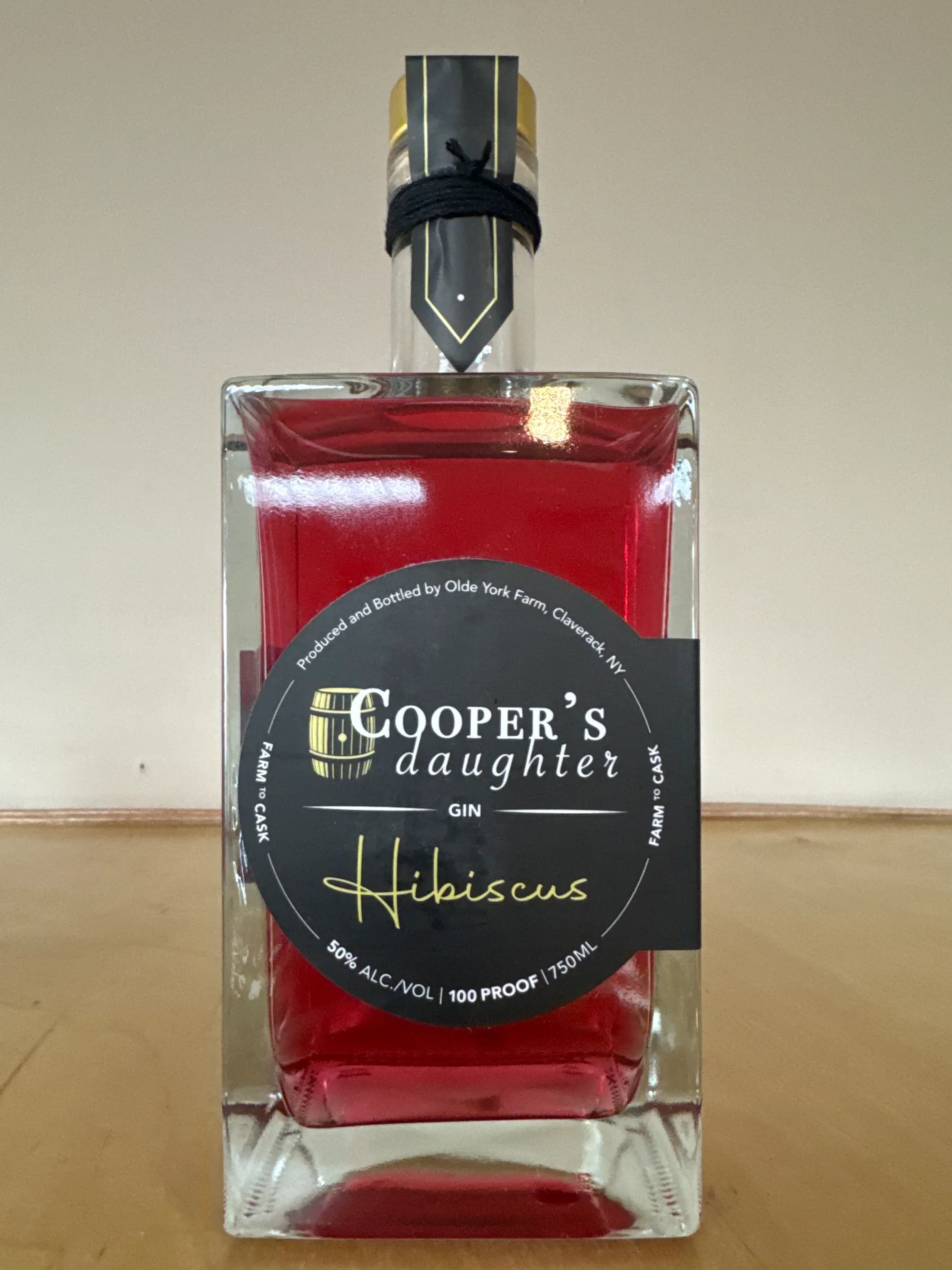
The original bottle and logo design is dark, moody, and slightly masculine.
The original bottle communicated handcrafted roots, but it feels darker and less emotionally connected to the idea of having elevated taste.
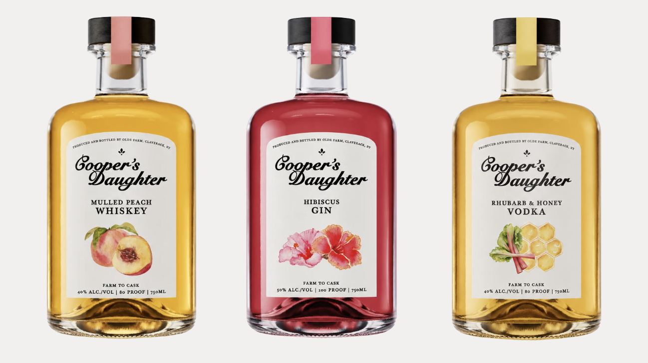
We redesigned the logo and bottle design to feel more feminine, premium, and modern, but still hand crafted and intentional.